The first impression of the new logo makes me wonder why Ubuntu needed to change the logo, which was looking far better in terms of visual appeal.
But then I realize that the presentation and look that is obtained by this logo are more sophisticated but also more creative, which in turn helps us to think outside the box, as they were arguing.
In fact, this logo signified the great leap that Canonical has taken and wanted to be more practical in terms of the previous logo.
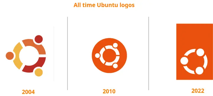
The first logo, which was introduced in 2004, has a multicolor with three solid dots attached to a circle, which resembles a huddle of three sports players, and Ubuntu represents three orange circles, which have freedom, collaboration, precision, and reliability.

In 2010, they made slight changes to the logo and maintained the Circle of Friends (CoF) with a single orange color over white, which looks more minimalistic.
The recent design has overcome the traditional circle with a long rectangle design, and if you notice the abstract concept, you will find three heads are facing each other and they are holding each other in a circle.

Marcus Haslam is the designer of the second and third versions of the Ubuntu logo, and he stated what drove him to make significant changes after 12 years.
Bringing in lateral thinking, feedback and creativity from across the business to get to the bottom of what the logo represents to see what comes out. And we did have some quite left-field ideas. But our values had not changed back then and neither have they now.
So in the end, nothing made sense apart from simply updating the Circle of Friends to a more contemporary look and feel. It was important to go through this process though, as it cemented our respect for and commitment to the Circle of Friends. Going full circle and coming back to it was a powerful affirmation of our values.”
The new logo will replace the existing logo with the release of Ubuntu 22.04 LTS, which will be released in April 2021, and subsequently, it will be changed throughout the Ubuntu family.
You can see the animation of the upcoming Ubuntu logo here and read the official blog.
Wrap up
I don’t think everyone will welcome a new design with an open heart, but once you know the facts behind the new logo, your opinion may change. Still, I’m not convinced with a rectangle design that looks totally weird.
What about you?
